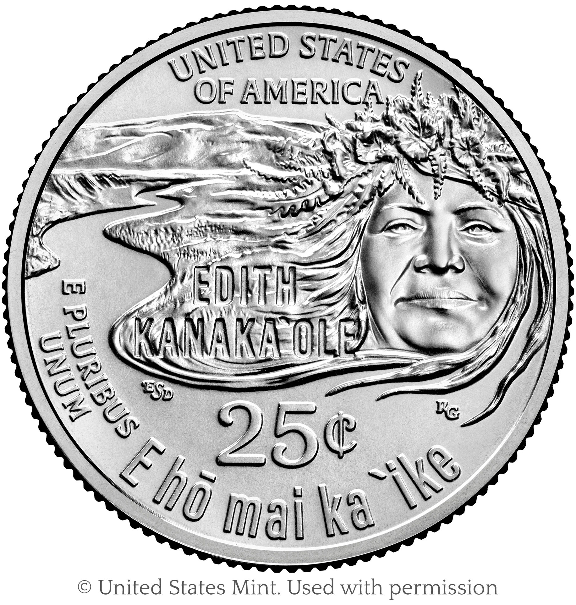
Once again, the United States Mint’s American Women Quarters (AWQ) program has introduced me to a remarkable American. Last time it was Anna May Wong; this time, the figure is Edith Kanaka`ole. Kanaka`ole was a Hawaiian woman who promoted traditional Hawaiian language and culture through her work as a dancer, chanter, and teacher.
It was a joy to become aware of Edith Kanaka`ole’s legacy as I developed a design for her quarter, which will debut this spring. As is often the case, the figure being honored has made an impact in a variety of ways, which makes it difficult to summarize her achievements with a single image. With Kanaka`ole, her deep connection to the land—her home in Hawai’i—played a large role in her life and her work. She grew up near the Mauna Kea volcano on the largest of the Hawaiian islands. To best honor her legacy, I felt that my design should emphasize her connection to the land.

Edith Kanak`ole quarter, designed by Emily S. Damstra and engraved by Renata Gordon. Image © United States Mint; used with permission
My favorite part of creating a coin or medal design is learning about the subject it honors, and that’s why I’m loving this AWQ series. Women have always played an important role in shaping American history, but their work is underrecognized in our history books, popular culture, and on our currency. It makes me happy to know that Edith Kanaka`ole will become known to a larger audience. The sort of work that she did—overcoming cultural bigotry to preserve traditional Hawaiian history and culture—is so important, and yet I think our society undervalues such work. I see this AWQ program as a step in the right direction.
Text on coins
This Edith Kanaka`ole quarter also happens to be a departure from the norm with regards to its text. For the first time in nearly two centuries, the coin’s denomination is given as “25¢” instead of “QUARTER DOLLAR.”
In this Planet Money podcast episode, numismatist and Citizens Coinage Advisory Committee member Dennis Tucker gives some insight into why modern US coins usually spell out denominations rather than represent them numerically. The story surprised me. It’s not a legal requirement for our quarters to spell out the denomination, but it’s been a tradition for quite some time.
As a coin designer, I’ve been pretty annoyed with this tradition. I respect tradition when I can see the relevance of it, but I’m not one to unquestioningly do something “for the sake of tradition.” When I began working on designs for the AWQ program, I chafed against having to make room for “QUARTER DOLLAR” on my designs when there is so much other text to include. In addition to “UNITED STATES OF AMERICA,” “E PLURIBUS UNUM,” and the denomination, the quarter must include the woman’s name, and in the case of Edith Kanaka`ole, the phrase “E hō mai ka ʻike.” That is A LOT of text to have to squeeze into a coin design; 69 characters plus the denomination! Therefore, I decided to submit a design with the denomation as short as possible—25¢—despite knowing that at least one of the two committees that review coin design candidates prefers the traditional way of spelling it out. My design worked much better with the coin’s value denoted by only 3 characters, and the Design Brief I was given at the outset of the project specifically allowed it.
At the Mint’s request, I also submitted my design with the inscription “QUARTER DOLLAR” instead of “25¢.” You can see that version here, along with the other design candidates for this quarter. I was very happy to learn that my design was chosen, and honestly a bit gleeful to be told that the version with “25¢” rather than “QUARTER DOLLAR” would be minted. I am hopeful that I’ll be allowed to continue using the shorted version of the denomination in future coin designs.
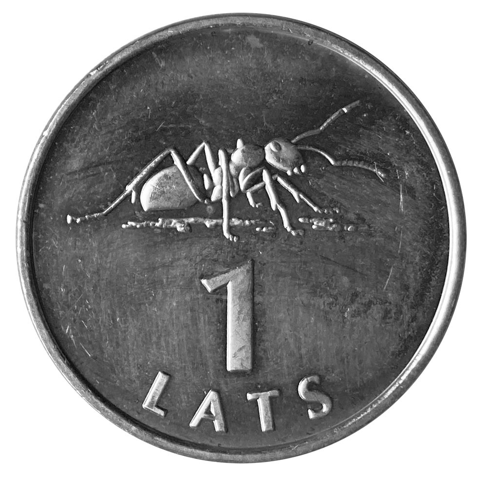
Although I haven’t done any sort of comprehensive survey of coins from around the world, I’m under the impression that the US is somewhat unique in having so much text on its circulating coins. For a fun little comparison, take a look at this 2003 example from Latvia, one of my favorite coin designs:

4 Comments
Comments are closed.
Congratulations, Emily! It’s been so interesting to read about your process and learn about these women. Thanks for sharing!
Emily,
Impressive design. Also like the use of 25C.
John Hunt
Thank very much, Karen and John!
Emily, thank you for describing the quarter, this way your article is enjoyable for visually impaired people as well. Interesting article, thank you for sharing this information.